Contemporary credit card member interfaces have gotten better; however they are still lacking at providing exceptional usage experiences.
Existing Ordinary Examples:


These visualizations are not only unimpressive for a member to see nearly two decades since these business have used the internet, but are also insufficient and inefficient at providing a quality picture of usage quickly. Often the user has to scroll through statement dates and download a statement in PDF to view activity past the current statement or navigate between tabs which both time and provide only siloed views.
They’re getting Better:
Citi’s ‘Spend Summary’ is a level above the rest and the best out there when it comes to enlightening its customers as far as I can tell [and that’s saying a lot because usually USAA is the bar none leader in banking UX (they rock!)]. I know that Citi has been making a big push to promote increasing their Global Experience Team (GxT) and offerings and the interface is evidence of that investment.
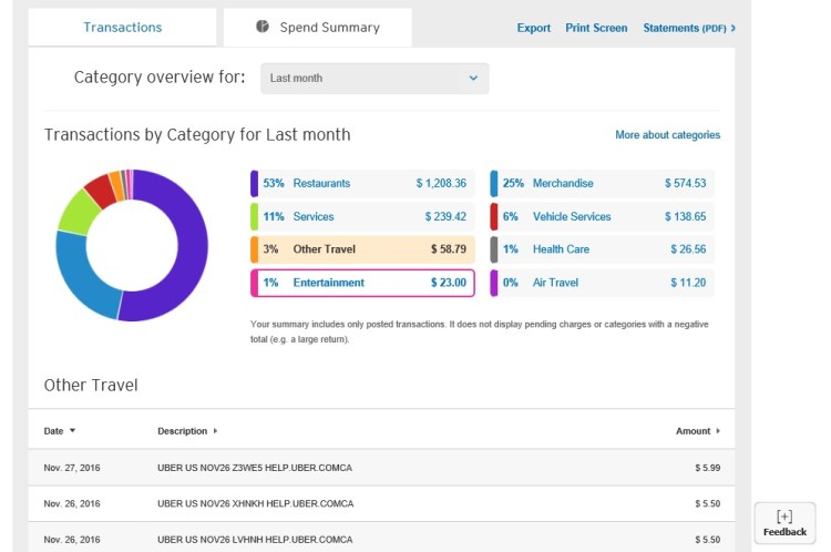
It provides a slight more conventional ‘donut’ visualization, the spending segmentation is dynamic, the speed of navigation is much faster than most statement retrievals, and the color usage is modern and elegant.
Concepts that are more Engaging, Useful, and Efficient:
Still I think there’s a lot of room to provide better the standard account data more effectively. With an ideal data visualization the user could see across 2 and 3 dimensions of their account instead of just 1 dimension at a time. The concepts created below do that as well display magnitude. They are meant to be informative, easy and engaging …yeah even fun to use.
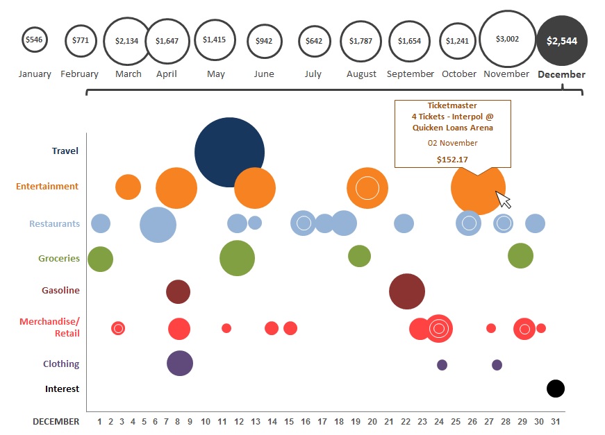
Advanced Scatter Plot: This one view provides a quick view of spending magnitude by month, and magnitude by type within the month, with each dot being a transaction (below).

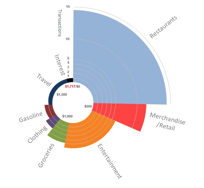
Semi-Circle Segmented Chart: This one also provides a quick view of spending by type within the month and breaks the lines by transaction and offers an atypical viewpoint that would drive inquisitiveness (below).
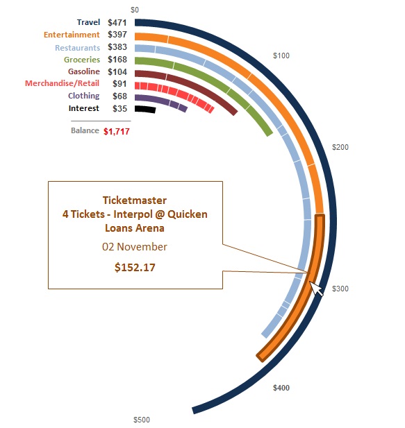
Nautilus Chart: This concept is basically an advanced donut chart which magnitude (number of transactions) in addition to percentage of spending by type (below).
Geolocation Bar Chart: This concept allows the viewer to see magnitude of category spending transactions and amounts integrated with the location of the purchase. The member can see data via contemporary with the extra engaging aspect of where the money when to (below).

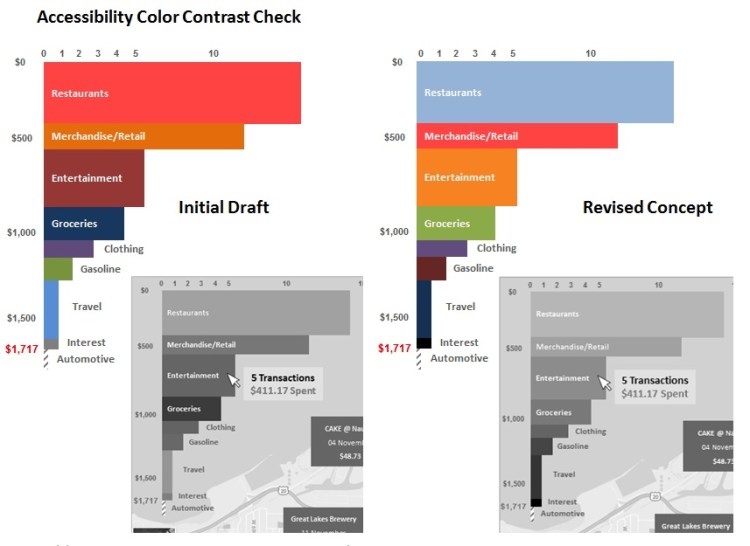
* Converting the initial concept to grayscale in order to gauge and correct the accessibility of the color contrast.