
Optimizing Business Insider for device agnostic adaptive/responsive experience
The following is an adaptive design example created demonstrating how to address site optimization across multiple devices (and resolutions).

Click on the image to open a working example prototype in which you can adjust your browser to see the various design breakpoints!
Using Axure’s ‘Adaptive View’ feature I created a set list of breakpoint sizes, which serve as design change points between a range target devices (and orientation). They are:
- Mobile Portrait (iPhone 6 in portrait orientation)
- Mobile Landscape (Samsung S5 in landscape orientation)
- Tablet Portrait (iPad in portrait orientation)
- Tablet Landscape (Samsung Tab in landscape orientation)
- Laptop/Small Monitor (A typical Laptop)
- Large Monitor (1700px plus large business Monitor)
* Axshare alternative concept link
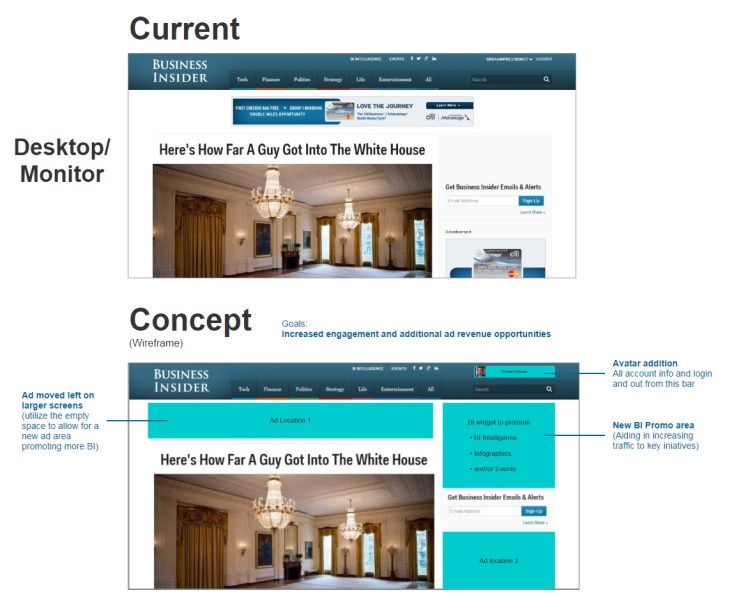
Optimization Aspects
Click on the two thumbnails below to see details regarding how a media site could be optimized in order to:
- Increase traffic
- Increase mobile usability
- Improve personalization and user engagement
- Reduce wasted/empty space in certain devices and utilize that space to increase (both 3rd party and self) advertising
Mobile (below) and Desktop (far below) Optimized

Adaptive vs Responsive
‘Adaptive’ and ‘Responsive’ design are essential today based on the great variety of devices viewers experience sites from. In short Adaptive design is a design with multiple fixed width layouts. Responsive design is a design with multiple fluid grid layouts. The design example at right is technically adaptive; however an adaptive prototype is also useful for collaborating on responsive designs as well.
* To learn more about these and other site frameworks visit the links below:
What is the difference between responsive vs. adaptive web design?: A good summary of the difference written by Ryan Boudreaux
Fixed, Fluid, Adaptive, and Responsive: A brief tutorial by Treehouse
 VOJIR DESIGN