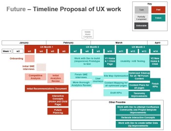
Rapid paced UX consultation commissioned to help TM Forum (IT professional non-profit) get their corporate and individual members more engaged.
Research: UX Review
Conducted thorough review of their site and offerings and detailed my review and recommendations to modernize in the following summary (107 pages / 4.9MB)
It touches on aspects such as:

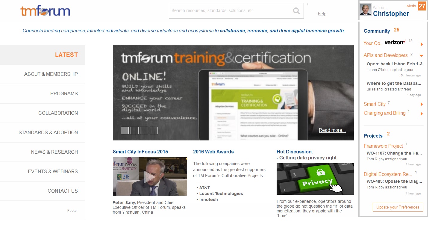
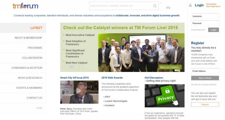
TM Forum existing Home Screen before:

Among many issues the greatest which the site suffered from included hiding too much content below the fold, obscurely passive login and search, convoluted megamenus, not educating the visitor about TM Forum, mission, news, benefits, etc. well, and finally providing too many screen variations with inconsistent elements and disorienting navigation.
Wireframing (based on my research, dialogue with SMEs, and goals of with TM Forum execs):

Wireframing centered around a strategy to improve content awareness, personalization, and clarity of navigation with a standard frame work that helps reduce the marketing and dev teams’ workloads.
Redesign Home Screen after (Unregistered Visitor):
The site redesign emphasized educating the visitor with the major offerings in a much clearer easy to navigate infinite scroll, greater display and personalization of content as well as a more blatant call to action for visitors to register or login.
Redesign Home Screen after (Registered Member):

Once registered the login sidebar transitioned to a ‘member dashboard’ that emphasized their activity with extranet platforms (using JIRA and Confluence APIs) to display pertinent project collaboration and community forums.
Redesign Child Screen (Registered Member):
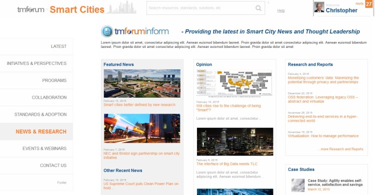
Child pages would fit the same template as the home. The resulting benefits again to reduce workload for the TM Forum team as well as provide the user with a consistent UI and structure to increase situational awareness.
The interactive concepts can be reviewed here: http://n3h0q2.axshare.com/
Visual Marketing Mock-up :
Just a little bit of time on Photoshop to bring the new design to life.